The Role of Color Psychology in Interior Design

The psychology of color has become a hot topic in many areas such as marketing, art, and interior design. We are constantly surrounded by colors, yet we rarely think about the effect they may have on us. Our brain processes colors before words or shapes. They have a strong impact on our mood, emotions, and feelings – most of the time without us even realizing it.
The way we perceive different colors is quite subjective and can vary based on our personal experiences, associations, and cultural backgrounds. In many cases, the way we feel about a color is connected to our positive or negative childhood memories. Generally speaking, the area of color psychology still requires further scientific research, however, there are a few studies and observations that have pointed out some of the effects of colors that may have a universal meaning.
The smallest things can make the biggest difference
A small detail such as color can make a huge difference. In interior design, it’s essential to know how we’re affected by different colors, so that we can match them with the right spaces, creating the exact atmosphere we’re looking for. For example, if you love the color red, but are finding it difficult to relax in your bedroom that’s covered in red wallpaper from floor to ceiling, it may be time to reconsider your choice.
While there are many ways of incorporating a new color into your interior, one of the easiest and fastest ways is using peel and stick wallpaper. It can be as temporary or permanent as you like and has an endless amount of color variations. The easy application and removal of peel and stick wallpaper allows you to experiment with colors and patterns, adjusting the color of your walls to the way you feel.
Let’s dive a little deeper, and find out what impact each color has on us, and how to choose the right colors for your home! Whether you want to go all-in or simply add a pop of color here and there, knowing the psychological effect of color in your interior design will help you make a better decision.
Primary colors
Let’s start with the very basics: the primary colors. You might recall learning about blue, red, and yellow in school. These three colors are the foundation of the color wheel and when mixed together, create secondary colors.
Blue
Blue is considered to be one of the strongest hues in color psychology. It’s associated with the feeling of calmness and tranquility. In nature, we see blue in the form of water and the sky, which often makes us feel relaxed and at peace. Deep, bold hues like navy blue, are linked to qualities such as trust, peace, loyalty, and success. Lighter shades of blue, on the other hand, have an instant effect of serenity.
Due to its calming effect, blue is a great option for spaces where you want to create a relaxing atmosphere, such as bedrooms, living rooms, and bathrooms. The incorporation of blue in your interior can bring a sense of calm to your otherwise fast-paced life.
Here are some of our favorite blue peel and stick wallpaper designs
- Bright blue solid color wallpaper
- Minimalist delicate leaf wallpaper
- Scandinavian blue circle pattern wallpaper
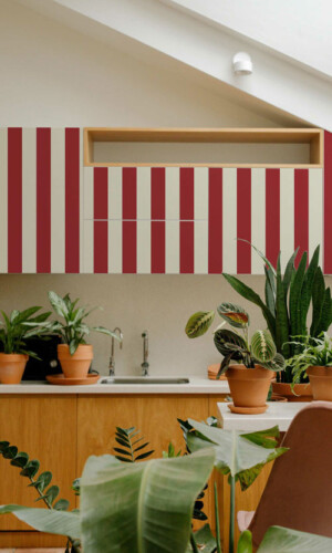
Red
Red is probably the most evocative and intense of all colors. Often at times, red is linked to sentimental feelings of love, passion, and desire. Advertisers take full advantage of the connection we have to the color red, for example, with the wide use of it on Valentine’s day. Interior designers are quite wary of its effects as well. Have you ever noticed that some restaurants incorporate red as part of their interior? That is simply because it is known to enhance our metabolism. This is why red is often a great option for a kitchen, however, you might want to think twice before using it in the living room or bedroom (and save yourself those few extra trips to the fridge).
For those who like bold color schemes, red is definitely the way to go. Just keep in mind that it may feel overpowering when used excessively in smaller rooms. It works great as an accent, especially on walls. Whether you want to create a strong impression in your hallway or spark conversations in your dining room, using red in your interior can help you achieve that.
Strongly associated with ambition, energy, and determination, red is also a great option for home offices or other creative spaces. Other colors related to red are magenta, burgundy, and maroon.
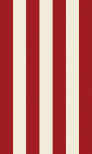
Here are some of our favorite red peel and stick wallpaper designs
Yellow
In color psychology, yellow is associated with energy, joy, and optimism. It’s the brightest color of the color spectrum and is known to be vibrant and spark joy. Yellow reminds us of sunlight and warmth and is often connected to happiness. On a sunny day, yellow is the first color we see when waking up in the morning, and it gives us that extra boost of energy.
Yellow works perfectly in spaces that don’t get a lot of natural light, but all in all, it’s super versatile and isn’t limited to any specific room. Include yellow in your kitchen, dining room, or living room interior to create a welcoming atmosphere. If you’re looking to create a cozy, playful nursery design, choose a mellow shade of yellow. If your goal is to create a living space that grabs attention, pure, bright yellow will most certainly get the work done.
Keep in mind that not every hue of yellow can have a positive effect. If the color is too bright, it can overpower the rest of the room and seem too busy for your eyes, as well as cause a feeling of distress.
Here are some of our favorite yellow peel and stick wallpaper designs
Secondary colors
Now that we’ve covered primary colors and the meaning behind them, let’s explore secondary colors. These are hues we get when mixing two primary colors together.
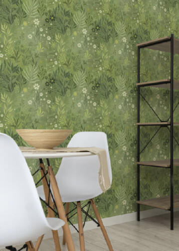
Green
The base colors of green are blue and yellow, and they’re the perfect representation of nature and growth. Green is known as the key color of purity, health, and freshness, and is suitable for any room in the house. Using green in your interior is the perfect way to bring nature into your home, especially if you live in a city with limited access to nature and green areas.
There are many shades of green available, ranging from turquoise to teal to olive and forest green, which means you can easily find the perfect shade for your walls. Bring the connection of nature into your home with the perfect green wallpaper, whether it’s in your kitchen, home office, or living room. Either way – green is a color that won’t disappoint!
Here are some of our favorite green peel and stick wallpaper designs
Orange
The combination of yellow and red gives us the joyful, fascinating, and tropical color of orange. As the only color that has gotten its name from an object – the orange – it’s associated with sunshine, creativity, enthusiasm, and success. Similar to cilantro, people either love or hate the color orange. According to the executive director of the Pantone Color Institute, however, orange is becoming more popular among consumers, so we are starting to see a lot more of it in interior design.
Just like its base color red, orange can stimulate your appetite. A bright orange accent wall in your dining room or a backsplash in the kitchen can add some warmth and adventure to the space (when used in the right amount, of course). For a more relaxing vibe, opt for a different shade of orange, such as apricot or coral.
Here are some of our favorite orange peel and stick wallpaper designs
Purple
Purple is a beautiful mix of red and blue and is often linked to a range of positive emotions such as creativity, nobility, and ambition. The color purple embodies a luxurious charm, which explains why it’s also considered to represent wealth and extravagance. If you’re looking for something that will impress your guests from the moment they walk into your home, think about using purple in your hallway.
For a more feminine touch, incorporate light purple wall decor in your dressing room or bedroom. Darker shades of purple can create a masculine feeling, perfect for a modern city home. As a hybrid of warm and cool colors, purple can elevate the atmosphere of the room and give it an entirely new look.
Here are some of our favorite purple peel and stick wallpaper designs
Neutrals
Last, but not least, let’s take a look at neutrals. Neutrals are easy for our eyes and, in general, visually pleasing. In an interior designer’s color palette, black, white, grey, and brown are extremely important shades.
Black
The color black is highly versatile and there are many different interpretations of this color. In some situations, it is associated with elegance, power, and mystery. However, black can have a negative nuance and in some cultures, it’s known as the symbol of grief.
The neutrality of black gives it the ability to work in any space, creating a timeless and elegant design, with a hint of mystery to it. Try not to go overboard with the use of black when decorating your home, and be thoughtful of its amount within your interior when it comes to wallpaper, furniture, and decor. Too much black can make you feel sad or down, which is probably not what you want to achieve.
White
White symbolizes purity, innocence, and light. It makes you think of new beginnings, and in a way, creates the feeling of a fresh start. In some parts of the world, white represents mourning and bad luck, but in most countries, white is connected with more positive associations.
It’s perfect for those who want to have some order, and space around them. White is easy to combine with other colors and works as a blank canvas for more colorful design elements. Using white wallpaper can help make a small room feel bigger, adding a bit of brightness to it at the same time.
Gray
Gray is characterized by its versatility and ability to create a range of atmospheres. It’s one of those colors that can be both warm and cool, giving you a sense of calmness and security. Just like with any other color, it’s important to note how it should be used within your home. Going overboard with a dark, gray wallpaper can create an overly gloomy space. Soft gray hues, on the other hand, can create a relaxing space, which is perfect for family homes.
Brown
Brown is typically associated with structure, reliability, and resilience. It’s one of the main colors that occur in nature, and it’s often used in interior design. Wooden furniture, stone decor, and wallpaper in earthy tones create a relaxing and comforting space around us.
The color brown looks great in common areas, such as open kitchens, dining rooms, or living rooms, making it the perfect setting for a family gathering or a classy solo meal. You can easily combine different shades of brown, creating a stunning living room wall color combination. Experimenting with neutrals can be just as fun as decorating with bold, vivid colors!
Here are some of our favorite neutral peel and stick wallpaper designs
Colors can have a strong impact on our moods, and the way we feel. Most of the time, these shifts in emotion occur unconsciously, but with a little help from the psychology behind colors, we can learn how to better understand colors and their impact on our surroundings. Don’t be afraid to experiment with colors – peel and stick wallpaper is the perfect solution for that! We hope this blog inspires you to explore how different colors make you feel and motivates you to give your walls a fresh set of colors!