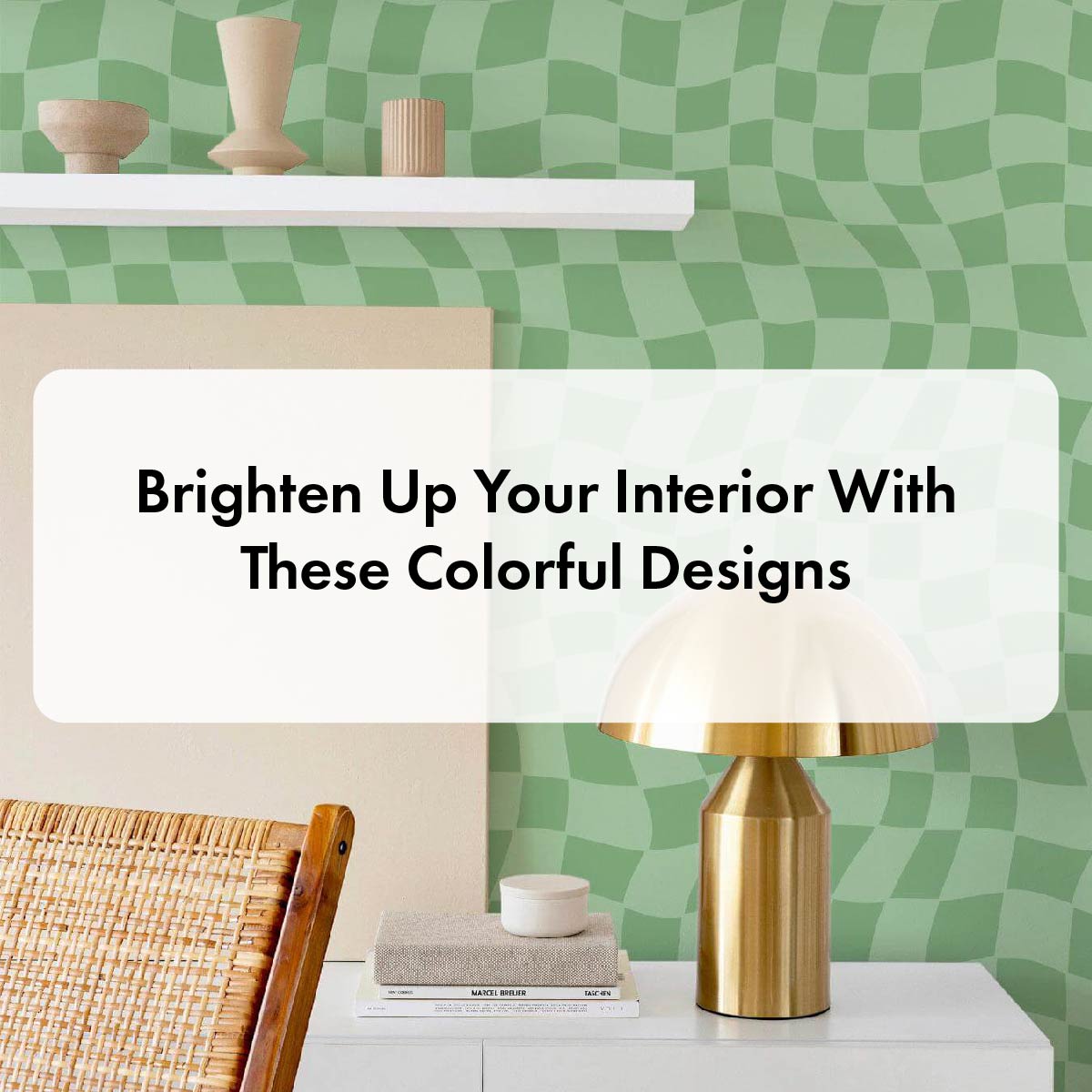
Brighten Up Your Interior With These Colorful Designs
Neutral color schemes will always have a special place in our hearts (and homes), but we may have to free up a little space for something new. Something playful. Something colorful. Something bold.
The increasing popularity of all things colorful isn’t accidental. Color experts are drawing a connection with the slow but steady shift from safe, proven-to-work choices to more adventurous color alternatives to our desire to express ourselves. More and more people are using more saturated colors in their interior design to showcase their personality and to make something that’s unique and 100% theirs.
But what is a bold color, anyway?
A color is considered to be bold when it’s bright and heavily saturated. Bold colors are typically quite intense, and more visually striking and noticeable due to their vibrant hues. Bright and playful accents have certainly made their way into our daily lives through fashion, design, art, and even food among many other areas. Even though the rise of bold colors is considered to be a trend, we believe it’s here to stay.
If we’re looking at specific colors, warmer colors such as orange, red, and yellow are considered brighter than cool tones like blue and green. However, any color can be bold and bright if it’s used in the right way. Bold colors are often used to make a statement and create a sense of excitement and energy, and colors such as bright yellows, fiery reds, electric blues, and neon greens will definitely do the job.
Without further ado, let’s take a look at a couple of vivid and bold designs that will brighten up your interior instantly!
Orange, with a touch of watercolors
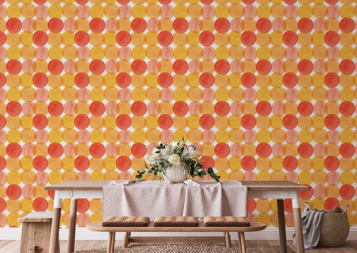
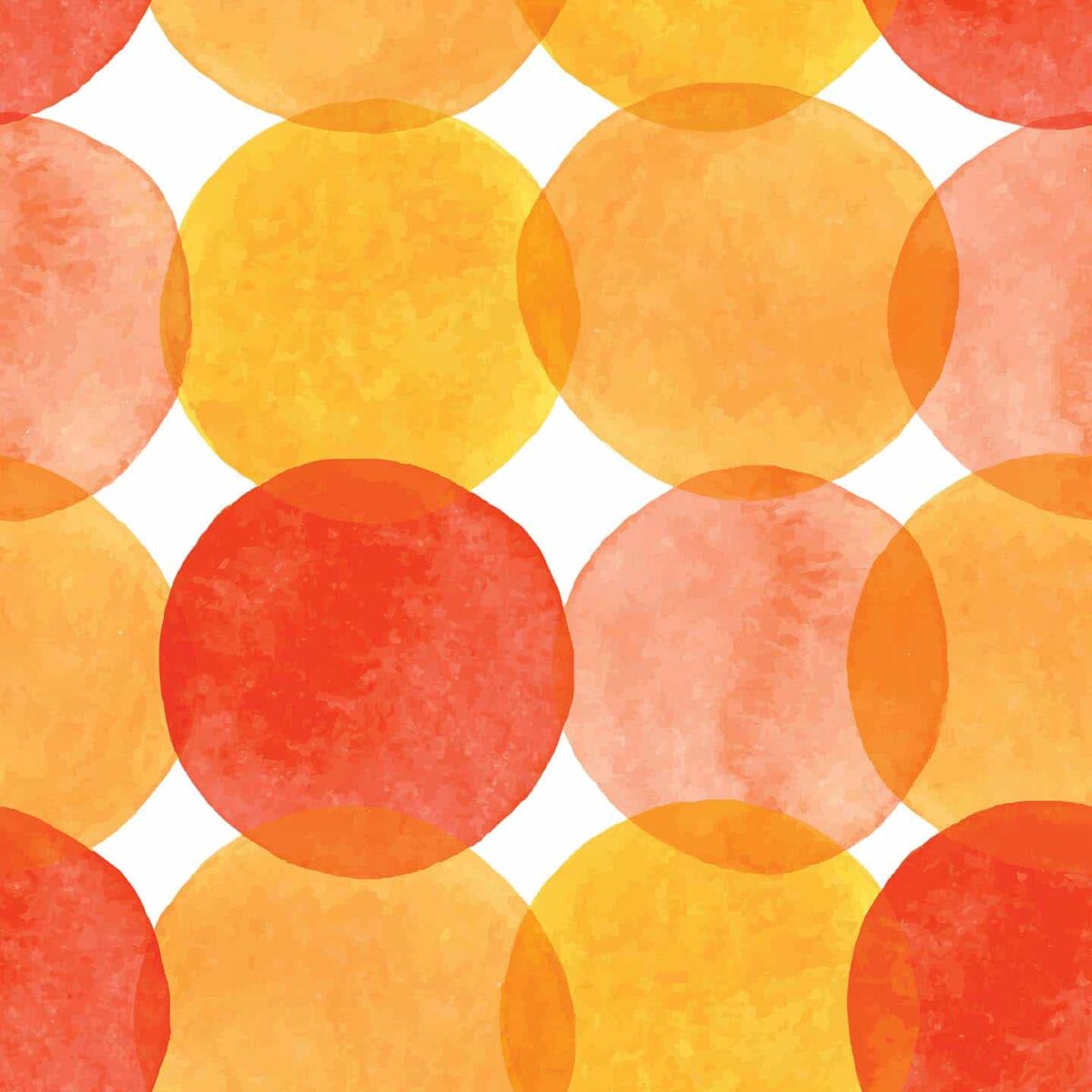
If you’re looking for a vibrant addition to your space, orange is the way to go. Orange accents add a lot of energy and warmth, not to mention the fact they look simply amazing! This orange watercolor dots wallpaper is one of our favorite designs. Saturated oranges and bright reds have come together to create a beautiful watercolor artwork.
Choose ALL the colors!
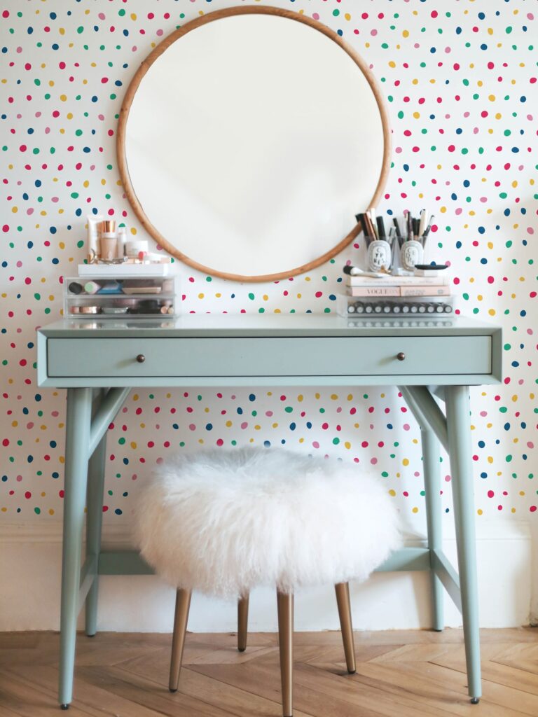
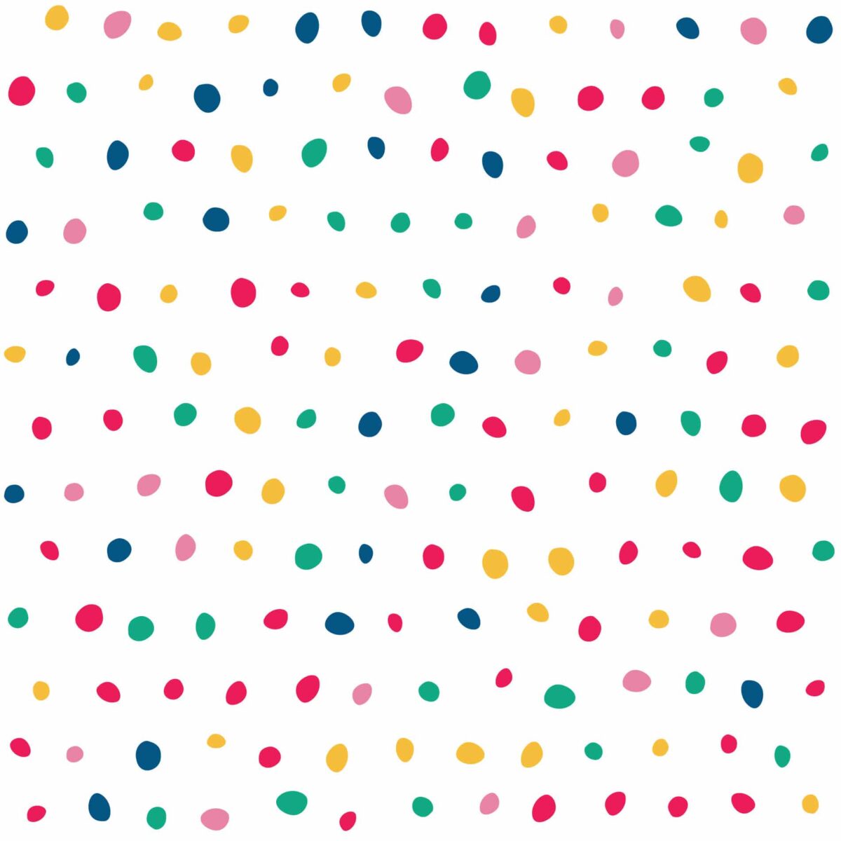
Sometimes picking one specific color can be tough. So why not choose them all? The key to a good result here is balance. Take this colorful polka dot wallpaper for example – it’s the perfect amount of color, balanced out with a white background. This is one of those designs that without a doubt would fit into any room – from a nursery to a living room to a bedroom!
Trippy greens for a fun accent
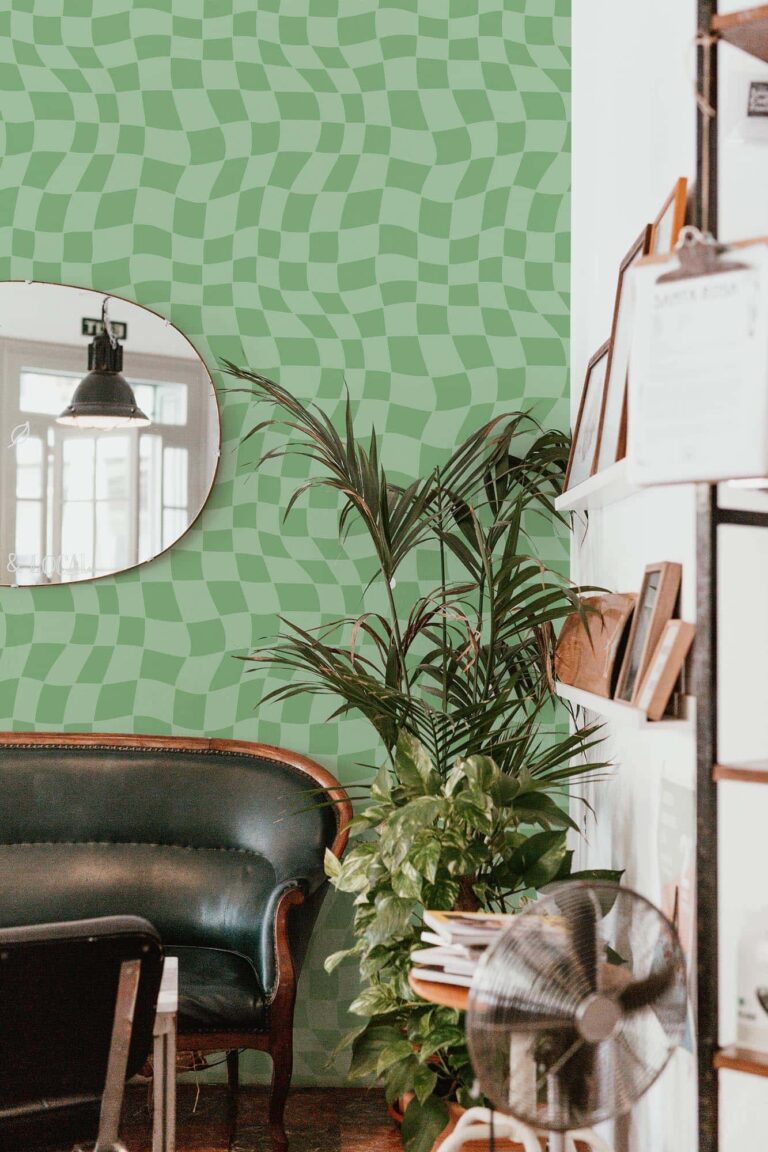
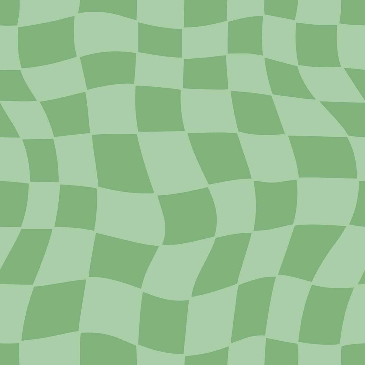
Green is a color that’s often associated with nature, growth, and renewal, which makes it a popular choice for creating a calming and soothing atmosphere. One of the most common reasons for using green decor in your interior is to create a closer connection with nature and the outdoors. This green trippy grid wallpaper is the perfect example of an all-time classic meeting a hot trend. Funky patterns are having their star moment and if you’re feeling a little funky yourself – try it out!
Color preferences are very individual and you should always stick to what suits your taste. Trends are a great source of inspiration and can help you with choosing a direction, but you’re in charge of all the details – big and small. Don’t be afraid to experiment with colorful designs and try out different things. Be bold, courageous, and playful, and say YES to colorful walls! with Fancy Walls wallpaper!
Vibrancy Without the Commitment
Bring joyful energy into your home with vibrant peel and stick wallpapers that let you express your boldest side.